Tangerine Apply for Product Experience Design
Redesigning the web experience with an end-to-end process.
Redesigning the web experience with an end-to-end process.
From our stakeholders, users have problem of going through apply for product journey, especially on select product page.
There were some usability issues, and also we needed to update Angular 8 on select product page. We decided to work on select product discovery in the following sprints and redesign the experience.
The whole project took me three months to complete. I split the whole process into four phases: background research, user research, insight collection and interface design.
After having kick-off meeting with product owner and business analyst, I also had one-on-one meeting with BA to further understand both goals and scope.
Before I approached the website design of select product, the mobile native experience for selecting product had been redesigned. I needed to identify the improvement from the current mobile design to To-be mobile design. Also, I reached out to the designer who was working on the design and understood the design logic behind To-be mobile design.
Since our mobile design has not been implemented, I will just show main changes on To-be design. There are four parts of main change: Navigation, Special offer, Information Hierarchy and Add Account.
After understanding the scope and requirements, I held several stakeholder meetings with teams across different departments.
CX team has conducted research on select product within onboarding experience,I gathered insights from them. Other designers from design team have previously found insights from Apply for Investment product journey. Our internal team also gathered some feedback from clients regarding the select product page and the whole flow.
I collected all those feedback and insights, and categorized them into five groups based on how users understand the product, whether users find the product, how users add the product, purpose of the page and the whole journey flow.
With BA's help, I had chance to look through google analytics data specifically on select product page. From google analytics, I identified the number of times users interacted with dropdown menu, search function, "Add" CTA button, "Learn more" button and the percentage of people who go from product visitor site to the select product page.
We found that 70% customer land on web channel to apply for product and 30% customer land on Tangerine app to apply for product.
In order to understand how users interact with the select product page, I conducted usability testing.
I focused on four goals:
1. Understand user pain points.
2. The findability of specific account.
3. The perceivability of special offer
4. User interaction of adding accounts.
In order to understand how users interact with the select product page, I conducted usability testing.
I focused on four goals:
1. Understand user pain points.
2. The findability of specific account.
3. The perceivability of special offer
4. User interaction of adding accounts.
Based on all insights collection, I prioritize all feedback based on user value and feasibility.
Our priorities are on:
1. Redesign the way presenting special offer.
2. Redesign user interaction when adding an account.
3. Rebuild the information hierarchy in the account card.
4. Redesign the product navigation.
5. Revise the product category labelings.
During the process of collecting insights and conducting user research, I started identifying all possible user scenarios.
There are a total of 11 user scenarios and 14 entry points to go through select product page (basket page).
I started creating the mid-fi design to see how new design looks like.
In our design review session, I presented my findings about apply for product journey and introduced mid-fi design.
After collecting feedback from design team and my project team, I made changes on some UI, which I was trying to deliver a more usable and intuitive experience.
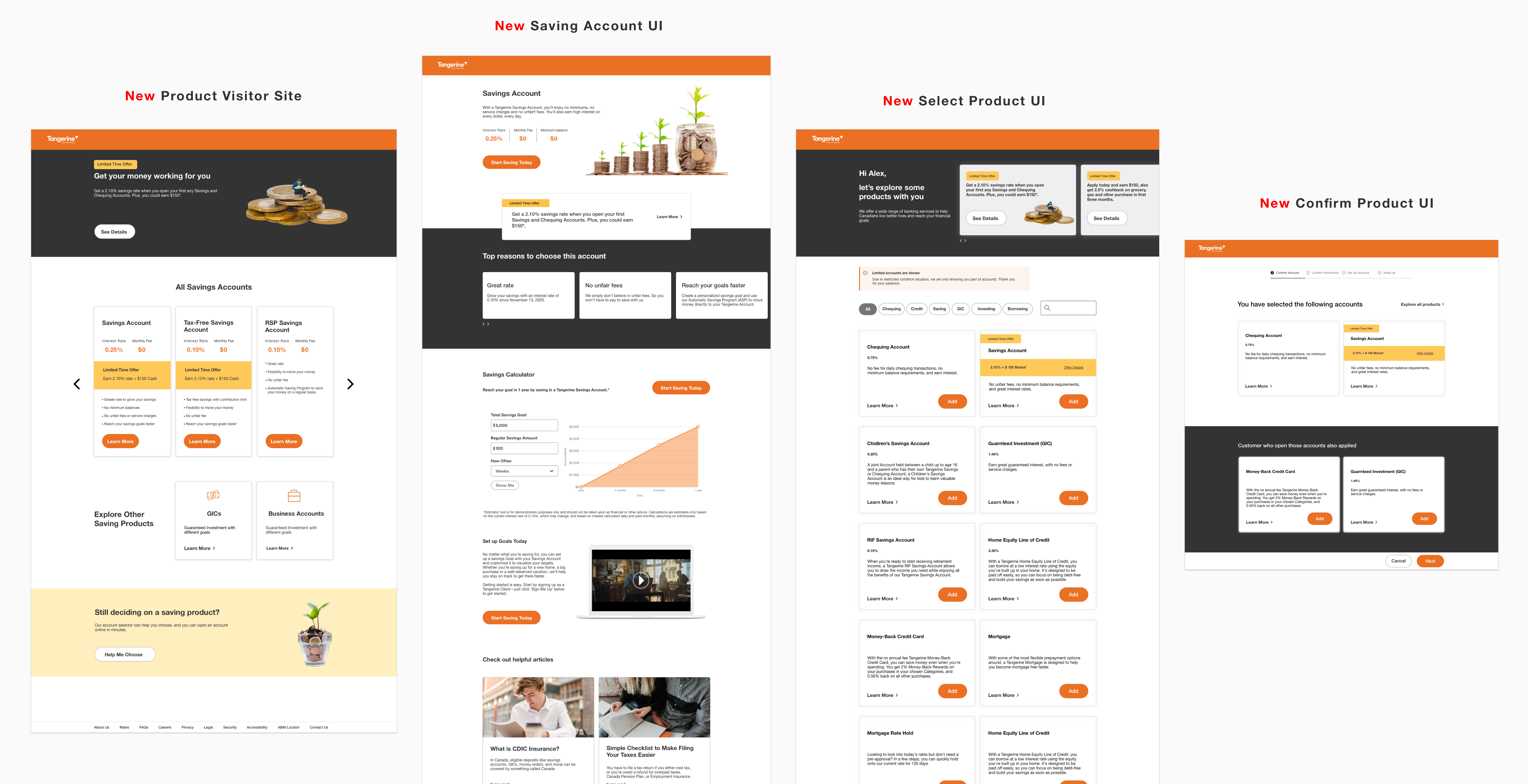
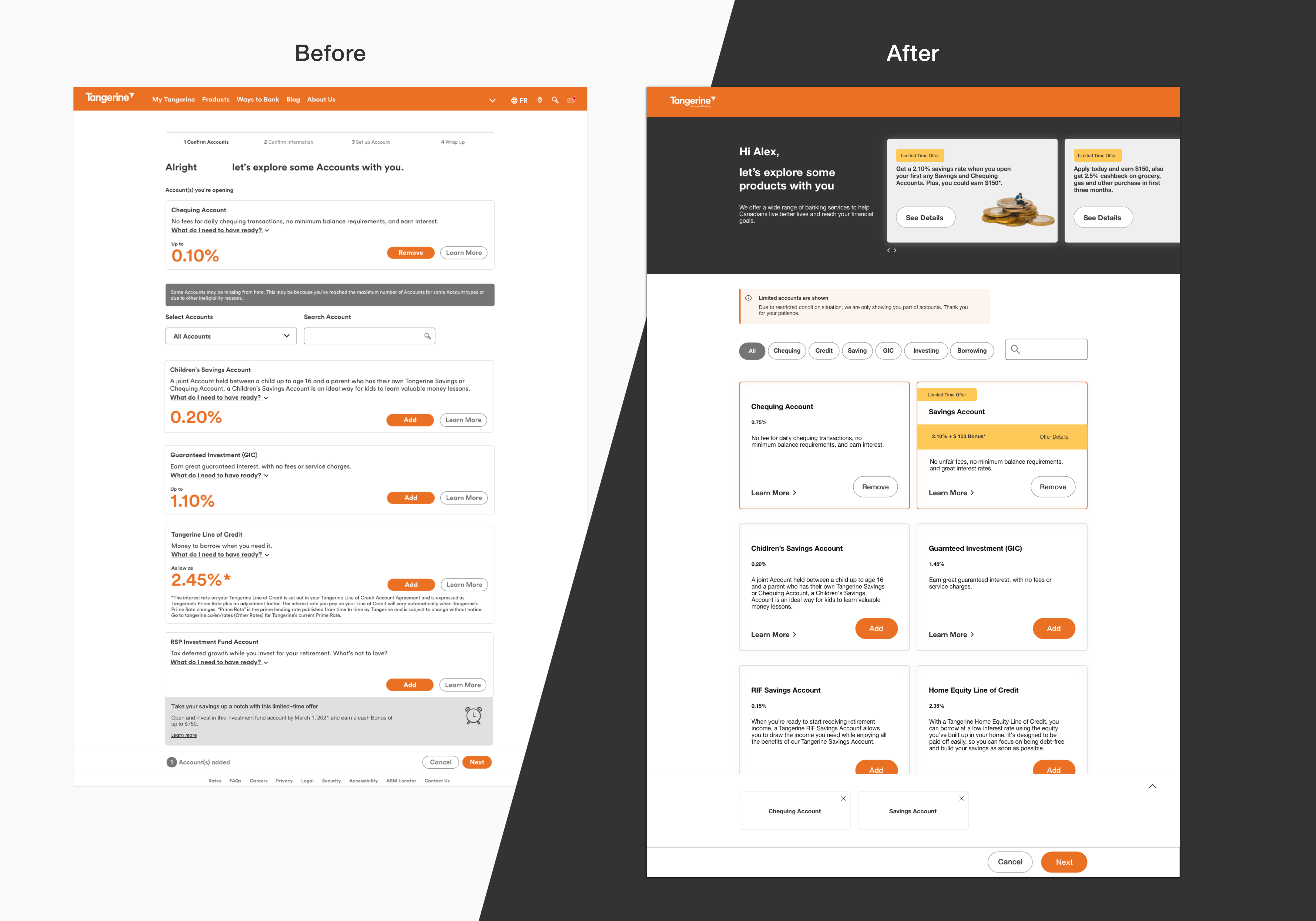
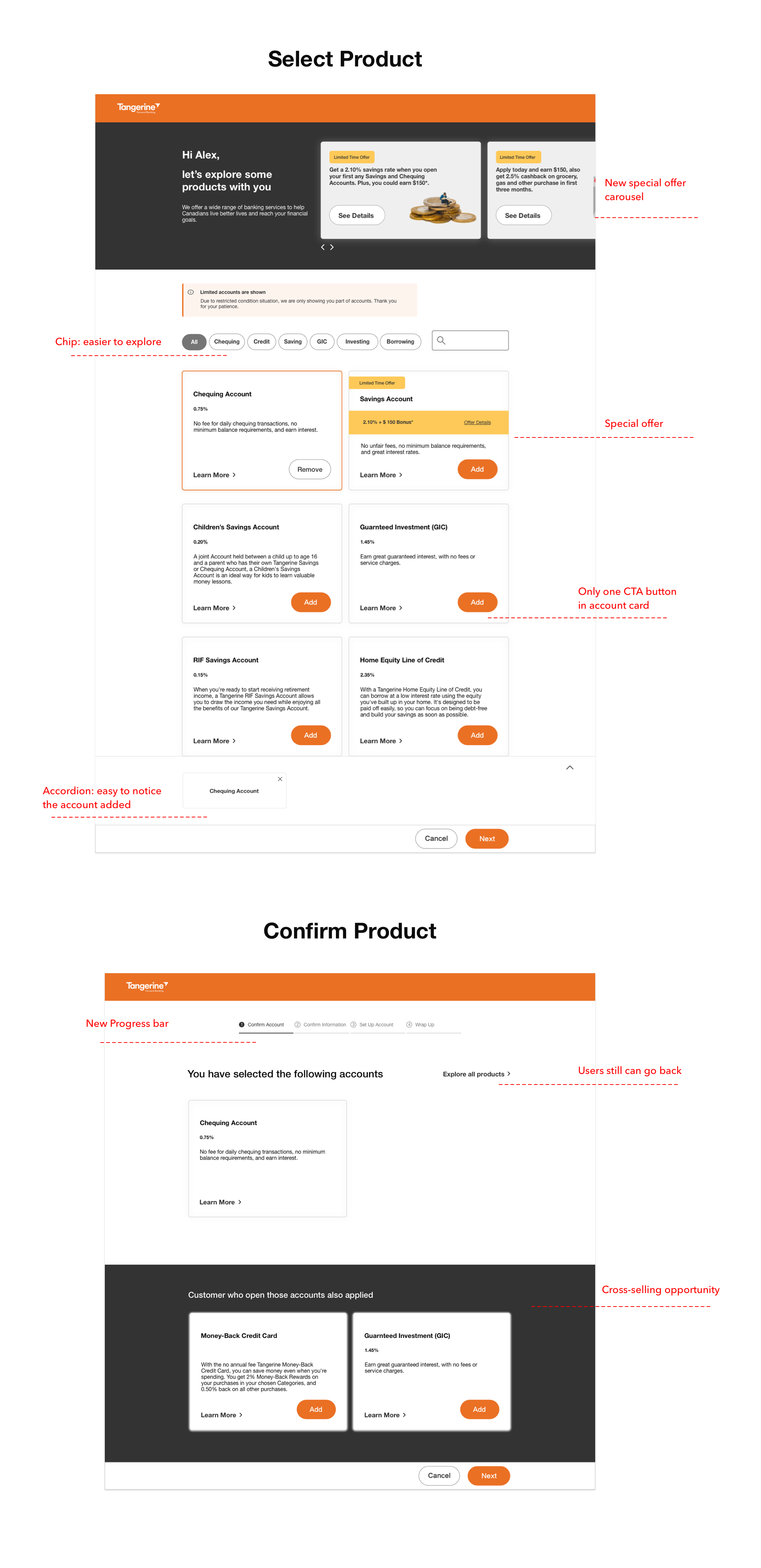
I redesigned add product journey. Instead of checking the added product at the top of the page, I used accordion at the bottom that the added product section will pop up when users add a new product.
Use chip to filter products
Displaying offer at the top catch users' eye, and they will quickly identify any potential opportunities.
Use accordion to notice the product add status
Users are able to quickly notice the account was added, and they can fold the accordion as well.
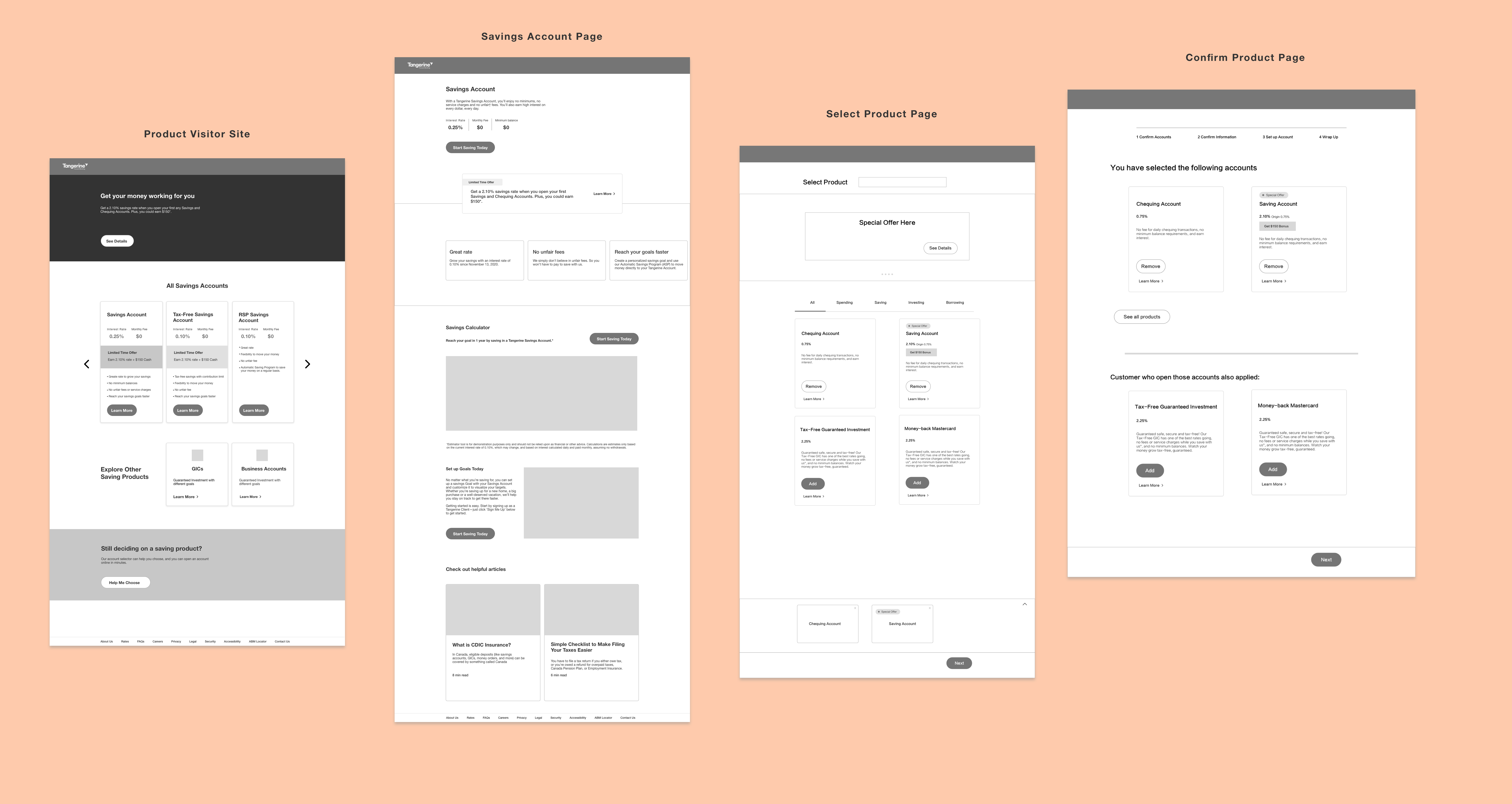
In current Select product, both exploring product and confirming the product are on the same page. Users complaint that they did not understand the purpose of the page, and could not notice the product was added. I decided to split select product page into two pages which include new select product page and new confirm product page.
Based on our marketing strategy baseline, I also added another feature which customers can see what other possible options are according to their choice. It is a cross-selling opportunity for company to grow sales.
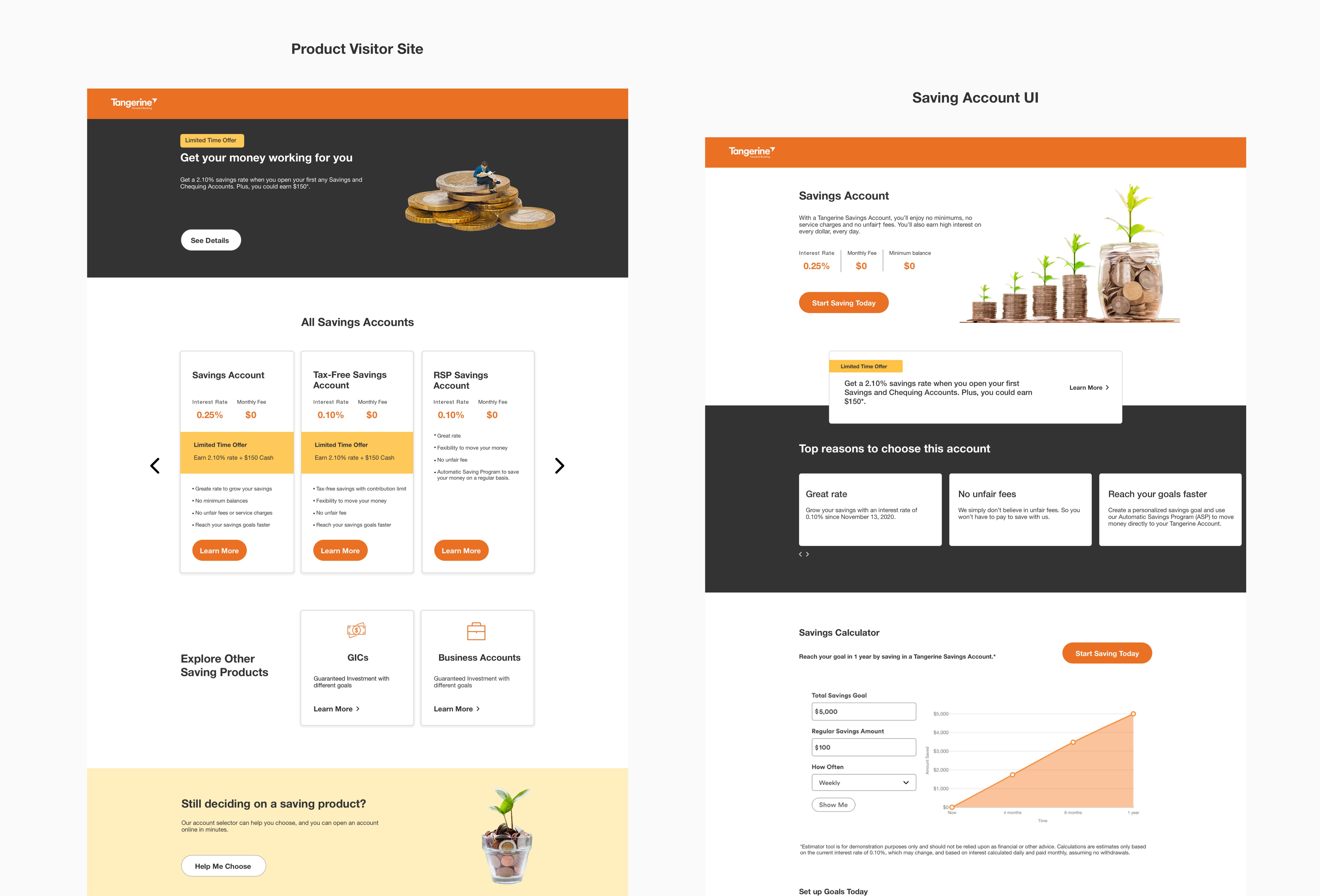
To make it consistent with Select UI, I also created new product UI.
My suggestions on product page:
1. Promote offer at the top of page and add special carousel.
2. Since we only have five saving products, we could just use a comparing mode to display those accounts.
3. Add account selector to help users choose an account.
Working in Tangerine provide me an opportunity to communicate across different departments and to gain both qualitative insights and quantitative insights. I have practiced UX research skills including competitive analysis, usability testings, card sorting study and tree testing. I also experienced the whole end to end design process from research to iterative design.
Thank you for taking your time to read about my previous experience. If you would like to learn more about my process, feel free to reach out!