Create To Learn App
Redefining a re-imaged mobile app experience for Indigenous youth.
Redefining a re-imaged mobile app experience for Indigenous youth.
We designed a new Create To Learn web app in four months.
- Lead Requirements Gathering
- Map out User Flow & Medium Fidelity
- Design High Fidelity for Home Screen/Course Screen/Browse Flow
Taking It Global, which is also known as TIG, is a non-profit organization focusing on supporting Indigenous youth to get involved and grow regardless of where they are in the world.
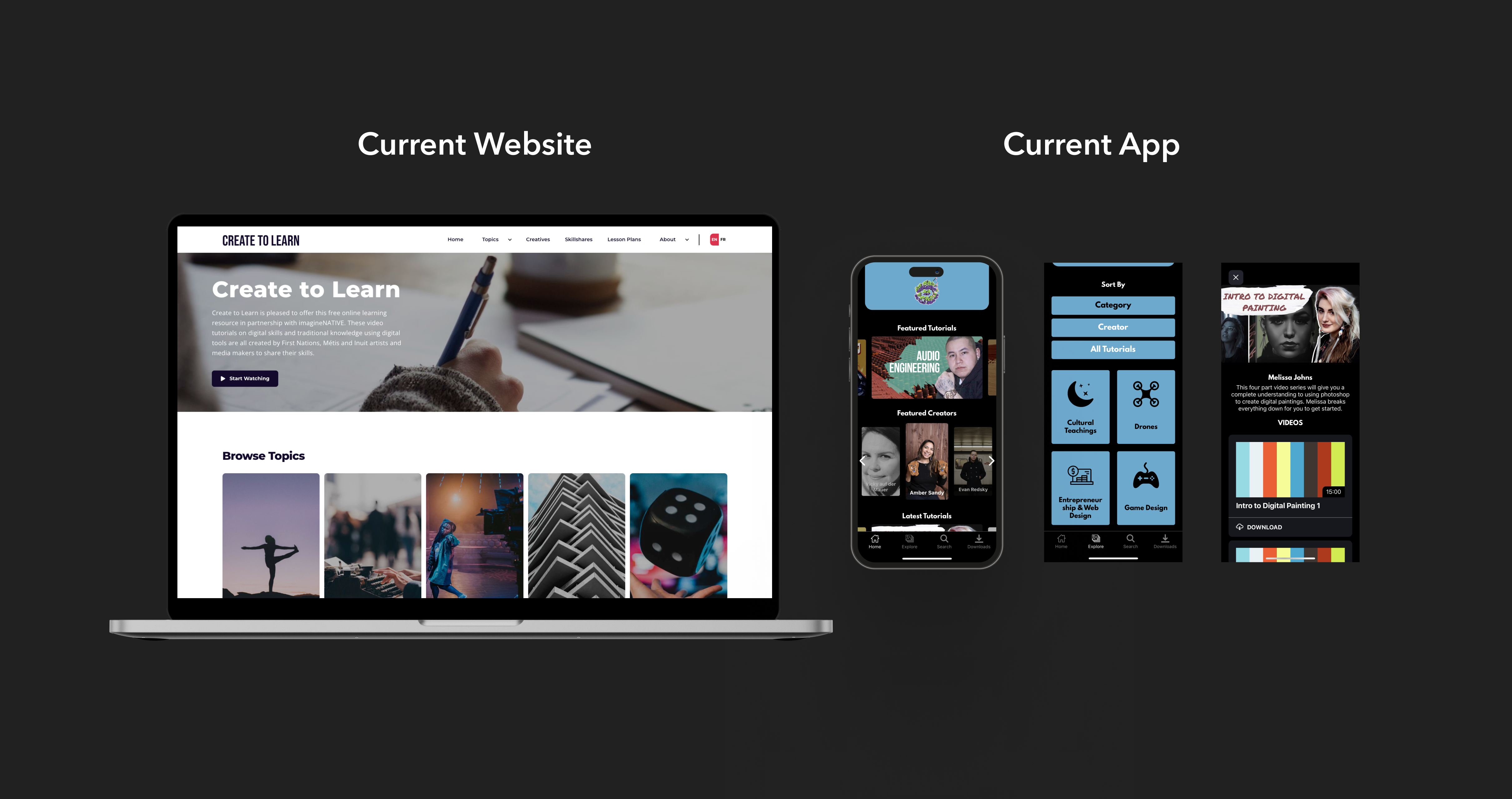
TIG introduced Create To Learn web tool to help indigenous youth foster their creativity and digital skills. More than 11,000 learners can access the web site and watch more than 300 free skill-building videos.
Create To Learn web tool is not able to satisfy all indigenous students' needs. From our research phase, we found that Create To Learn web tool is not accessible for most of students. They could only get access of the tool in class with the teacher's laptop.
In 2020, C2L app was launched with a short-time development. Unfortunately, TIG found that the app was not actively used by students.
In Phase 1, our UX Researchers have conducted user research and UX audit for the current app. They identified three main problem areas.
There were so much we wanted to achieve and improve. What was our focus?
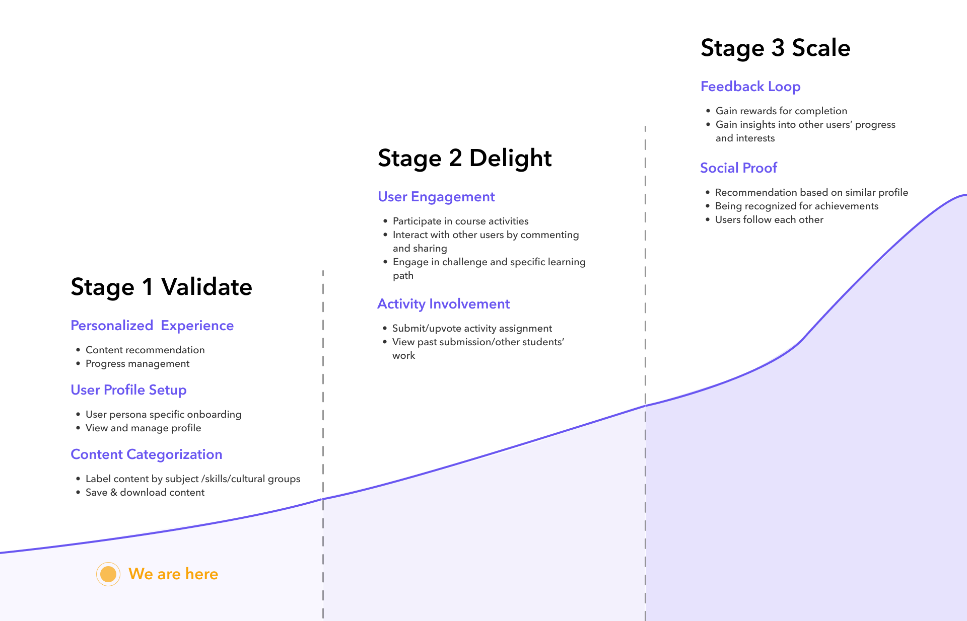
Before the phase 2 started, I met with product manager together to define three stages of product vision.
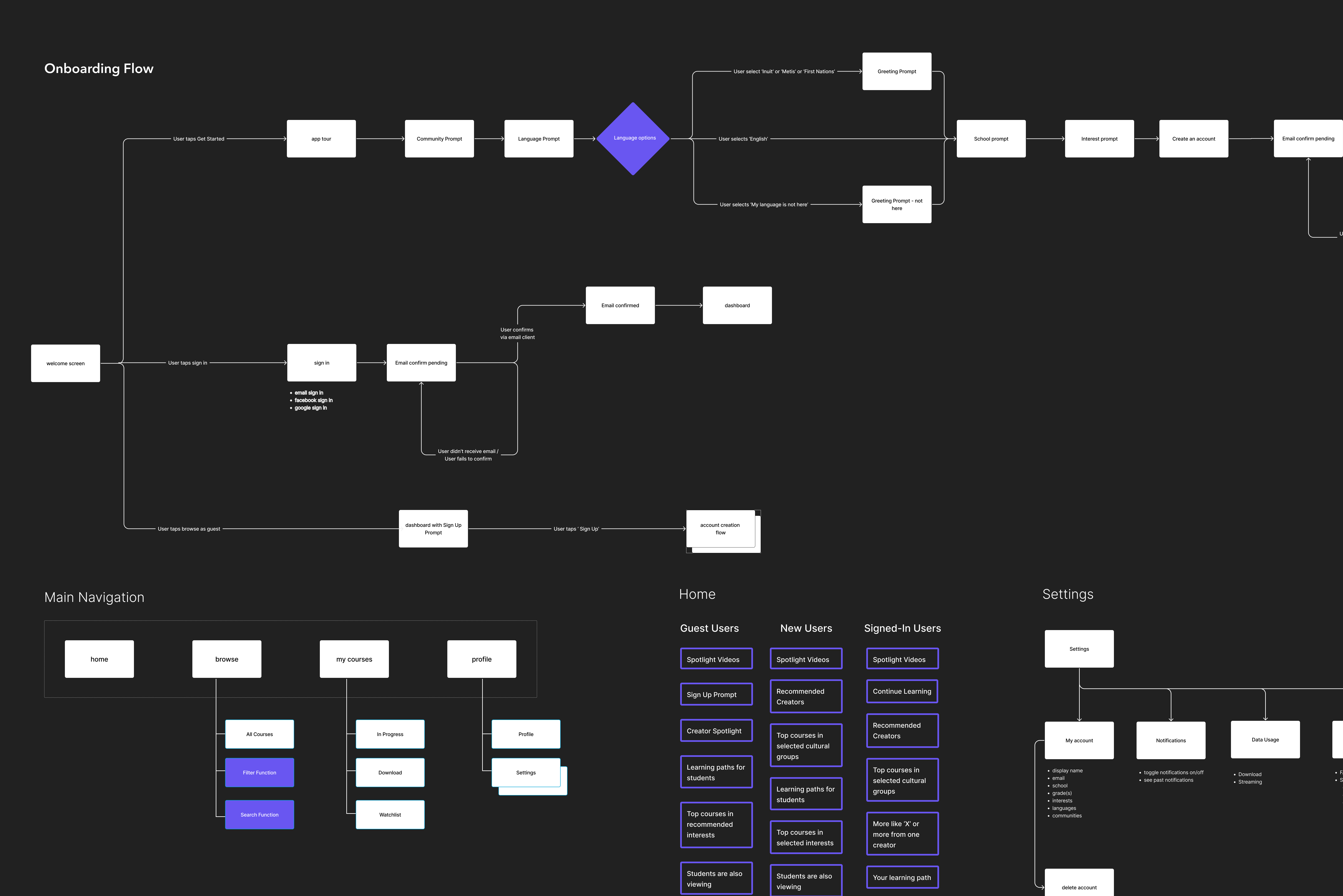
To refine the whole app, we started the design from stage 1.
The project applied agile methodology, and the timeline was split into six epics. In each epic, we focused on researching and designing one particular flow for two weeks.
At the beginning of the project. we met with TIG stakeholders one week to gather all business requirements and gain insights for all user flows. In the following week, we created medium fidelity design for the specific epic.I facilitated every session for sharing competitive products, understanding context, ideating features and prioritize solutions.
While ideating medium fidelity flows, I also started looking at other competitors' products and thinking about which UI style we wanted to apply for our app.
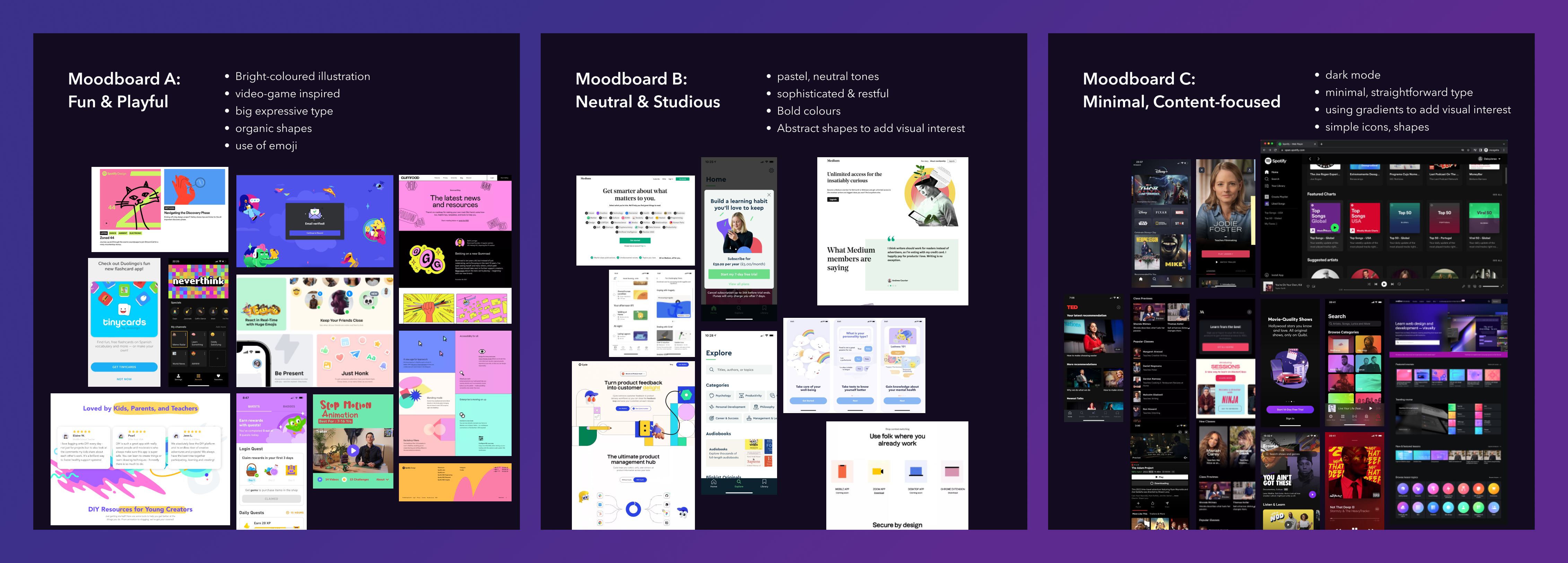
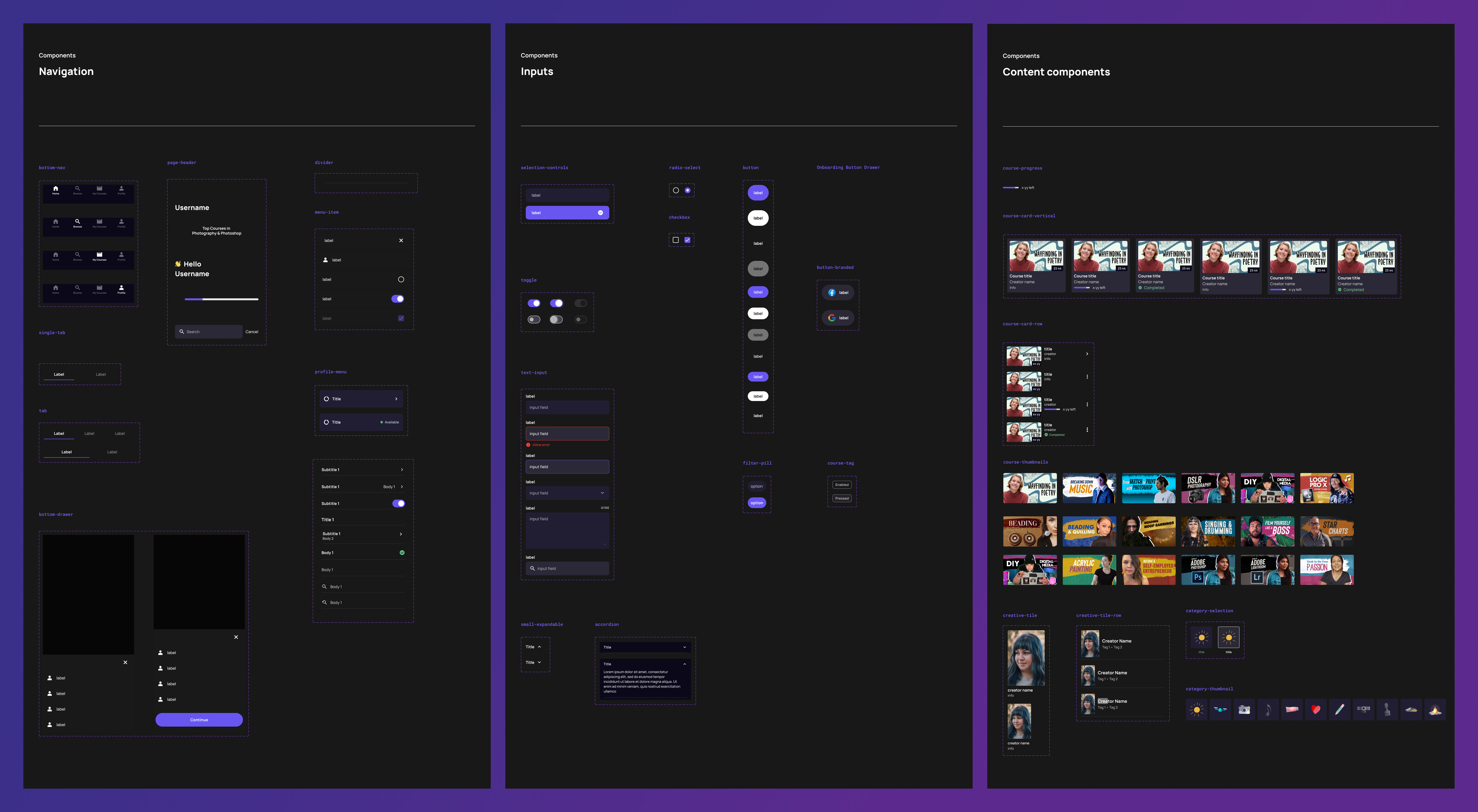
After deciding the style guide, I start creating components based on Material UI specifically focus on dark mode. I also explored how elevation works on dark mode help users understand the visual hierarchy.
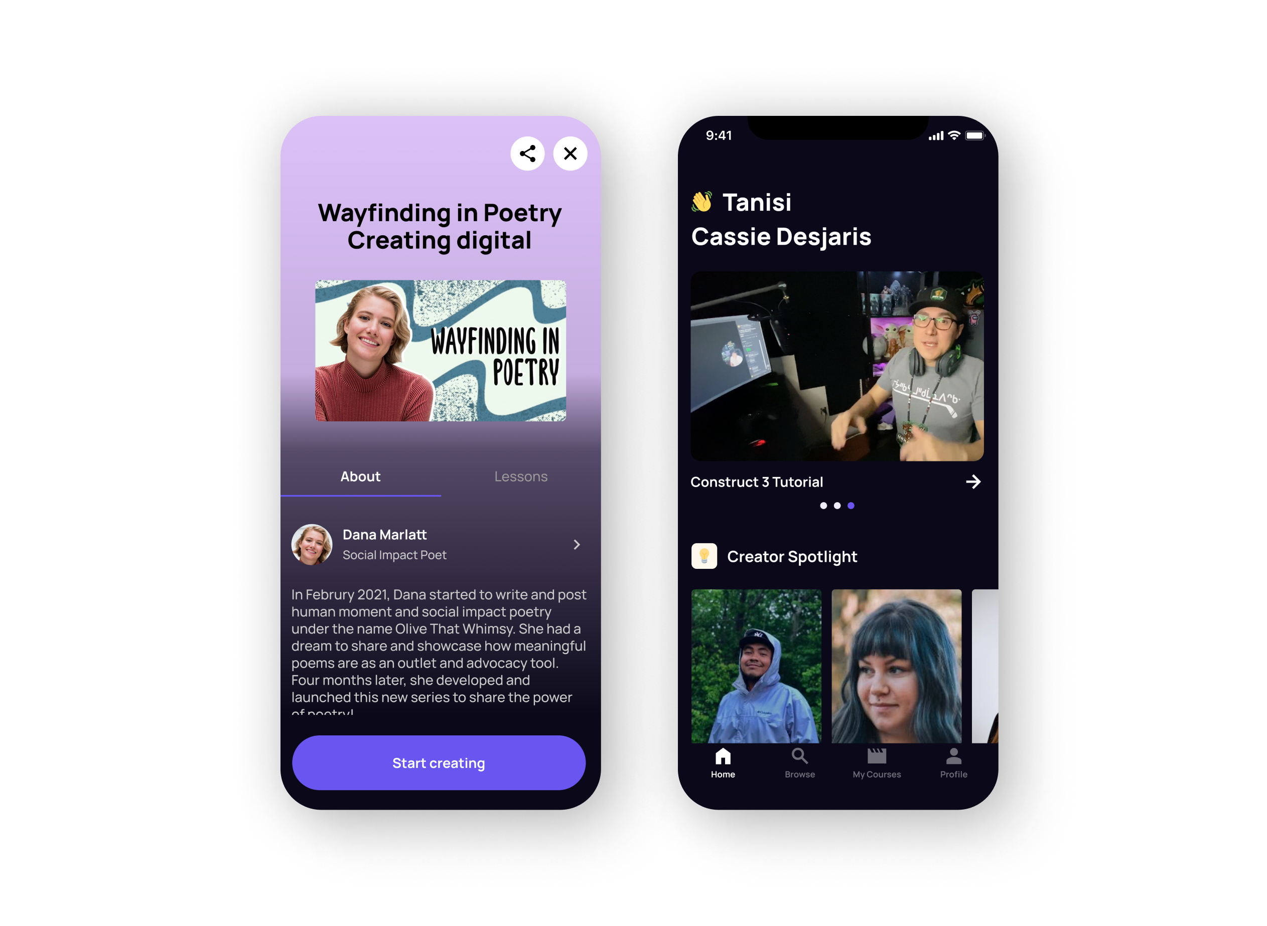
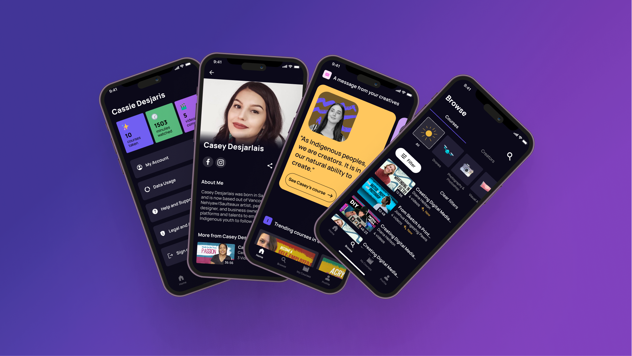
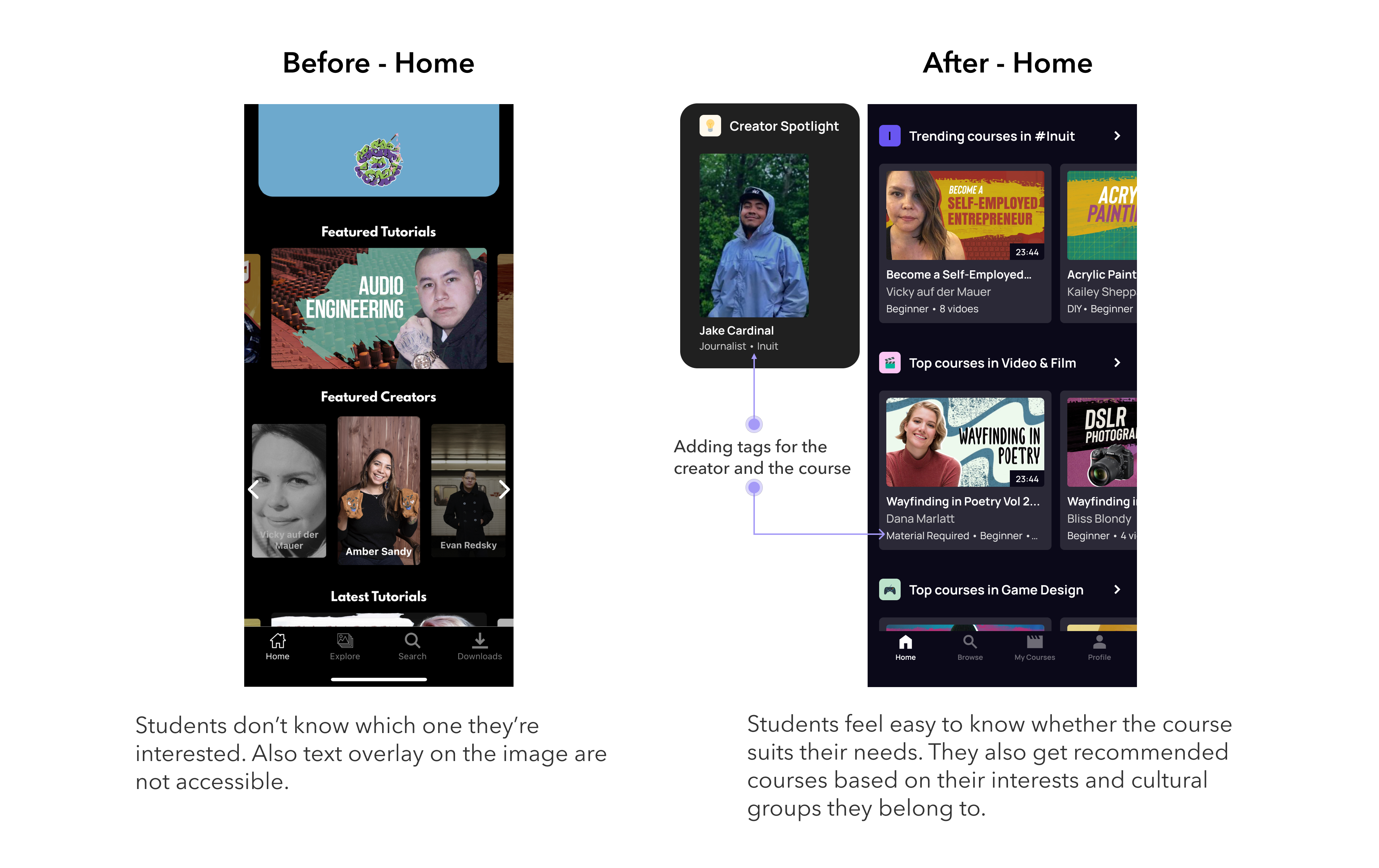
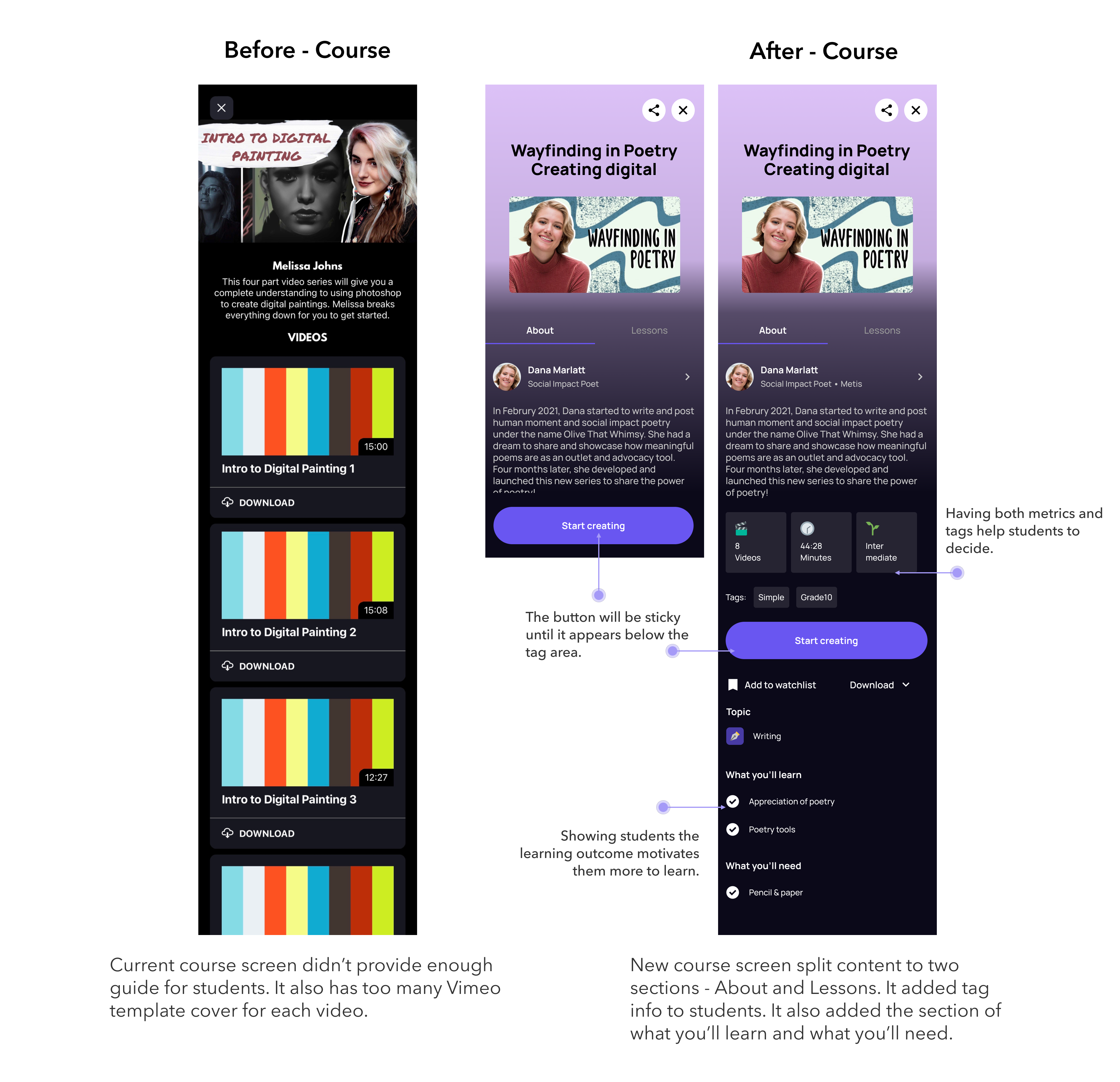
Based on the main problem areas we identified for Stage 1 design, we focused on optimizing discovery of content, providing personalized recommendations and helping students easily make decisions.
In our final session, we did a full walk through of Figma fie including high fidelity design flows, annotation guide, Figma resources and prototypes.
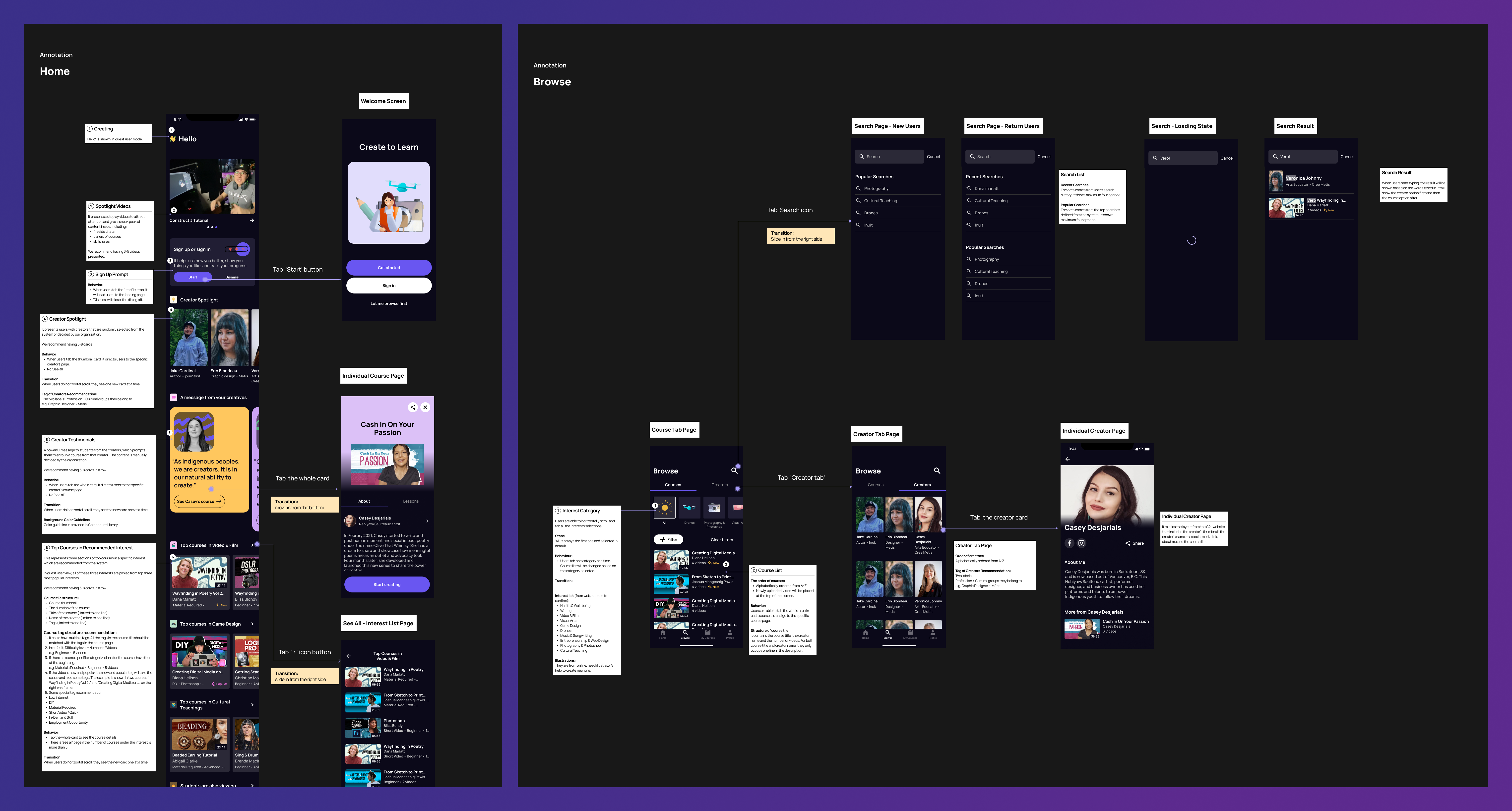
I built an annotation system and filled in the notes for each wireframe to help engineers to understand the flow, the logic and the requirements including the component's behaviour, transition, content guide, colour guide, and state.
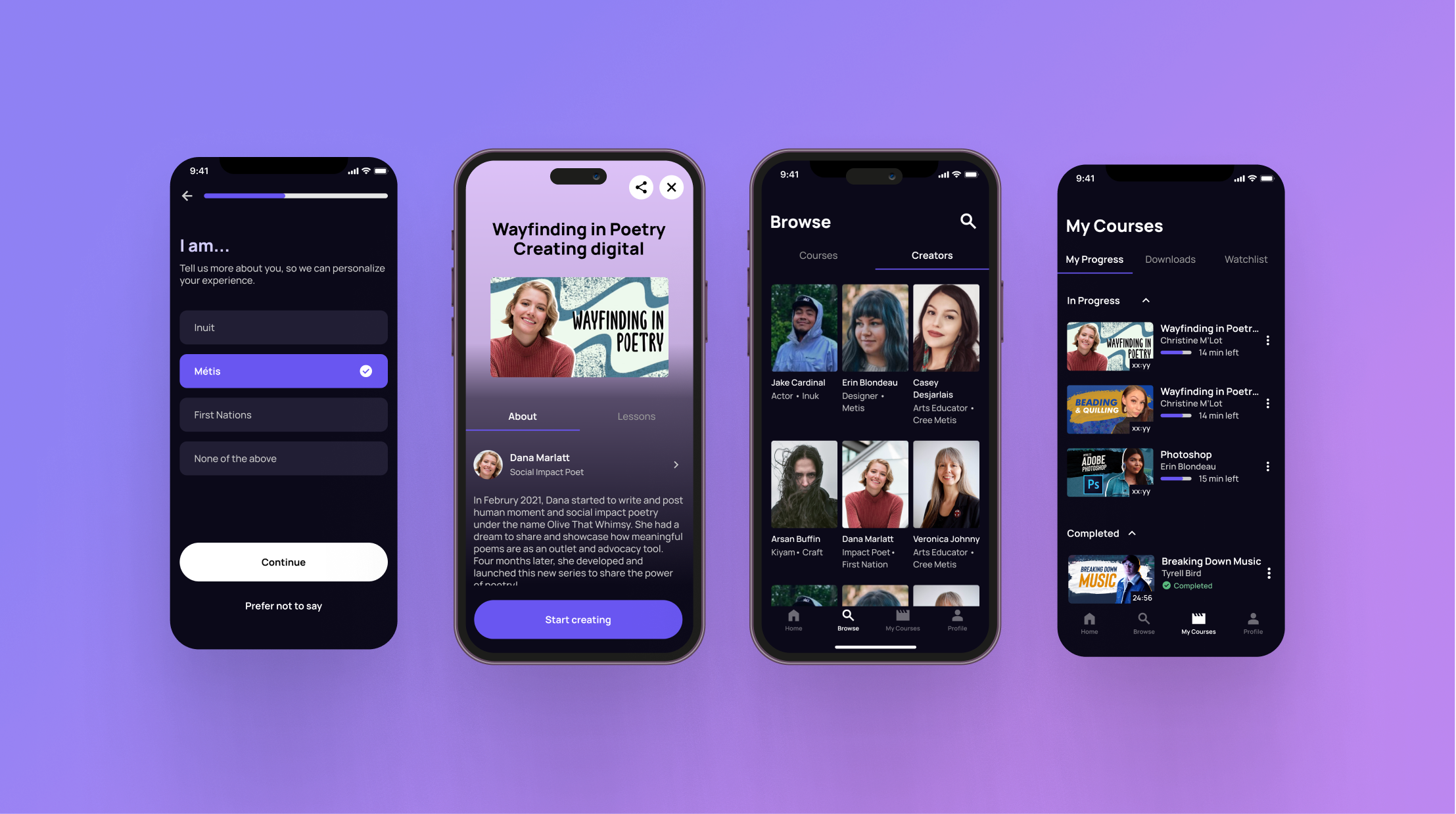
It is my first dark mode app design project, and I had chance to explore and research accessibility considerations on dark mode including optimizing colour contrast, ensuring readability, and building visual hierarchy.
I also collaborated closely with engineers to consolidate all the user stories, and we clearly set up all the flow logics, requirements and validation rules. It was a great opportunity to support indigenous youth for their growth and learning.
Thank you for taking your time to read about my previous experience. If you would like to learn more about my process, feel free to reach out!